

One of my favorite illustrations supporting the benefits of long-term investing has been making the rounds again as result of the market's losses in early August. You might be asking yourself, but the market has been going up not down since then, so why blog about this now?
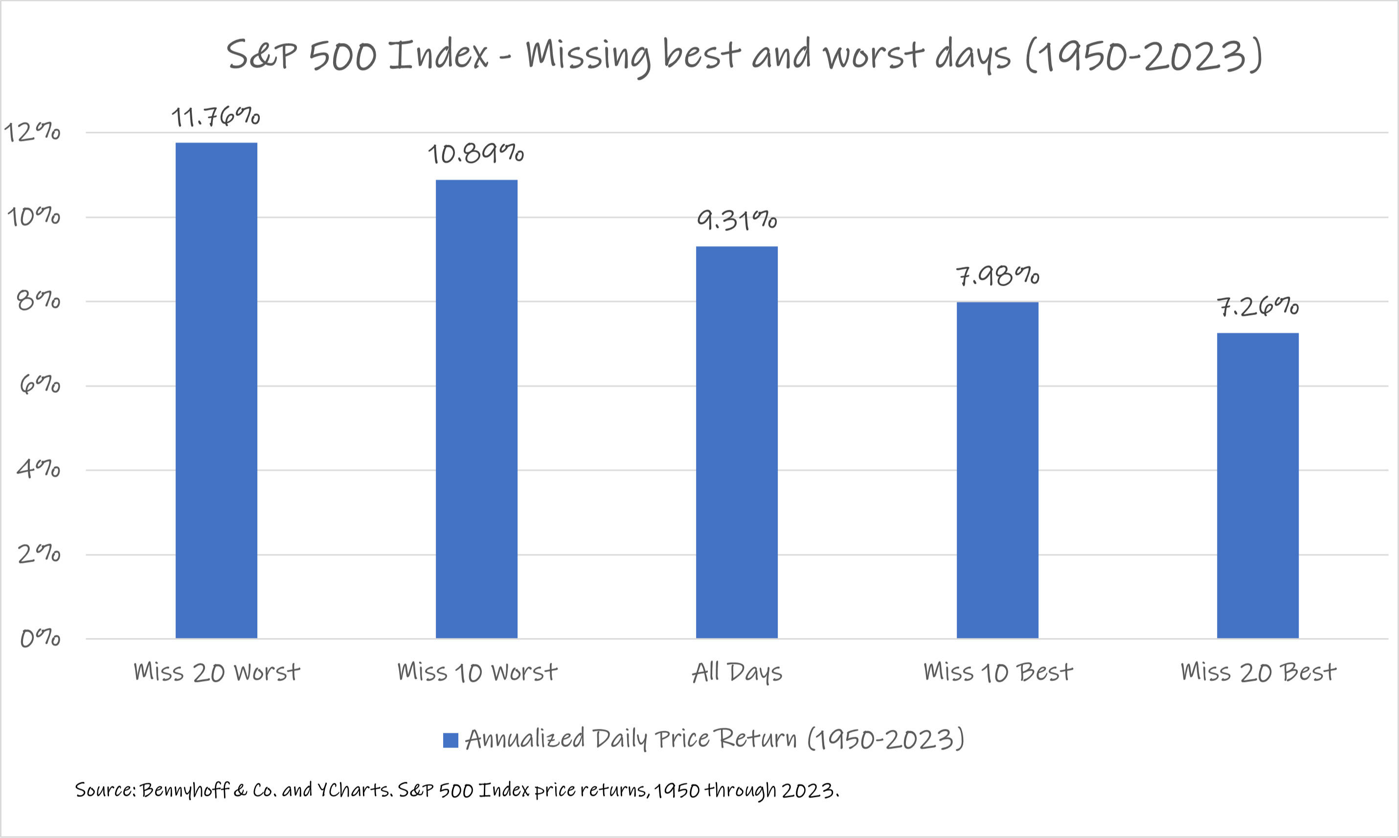
This chart often surfaces whenever there's a significant daily loss in the stock market, emphasizing the importance of staying invested to avoid missing the market's best days. As much as I applaud the strategic rather than tactical mindset, it is important to recognize that, depending on an investor’s perspective, the data can be a double-edged sword.
What’s often overlooked is what the data says about missing the worst days, as shown in Figure 1. It suggests that avoiding the worst days in the market leads to greater overall returns than the negative impact caused by missing the best days. That’s a very inconvenient conclusion for those who argue that market timing is a futile endeavor.
However, this data actually reinforces the difficulty of achieving higher returns through market timing, which ultimately strengthens the case for strategic investing. A deeper look into the historical data shows that the pattern of returns—not just their magnitude—is what makes effective market timing so challenging (Figure 2). Of the twenty best and twenty worst daily returns for the S&P 500 Index, about 40% of them (16 of 39) occurred within five trading days of each other.
Additionally, roughly 20% (8 of 39)1 of the highest magnitude days occurred only one trading day apart. This means that while the positive return consequences of missing either the best days or the worst days in the market are possible, they are not probable—both depend on accurate market timing.
Advisors seeking to help clients understand both the probability of success and the potential negative consequences of market timing should use these charts proactively, before the next “best” or “worst” day occurs - coach for tomorrow, today.
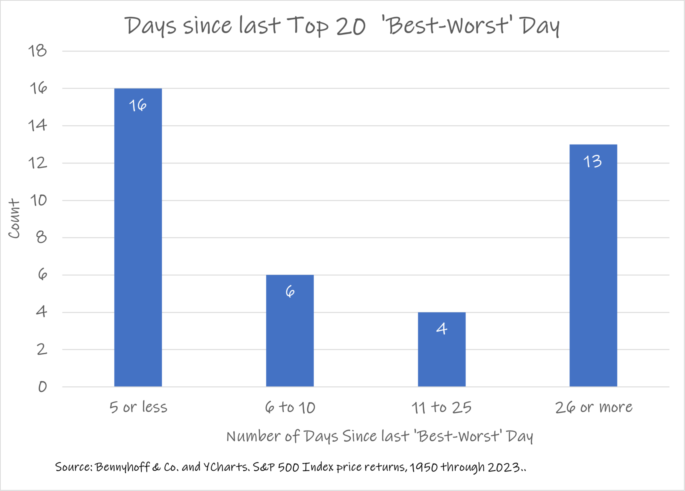
1While the 20 best and 20 worst daily returns resulted in the 40 observations used in the calculations in Figure 1, it results in only 39 observations for Figure 2. The calculation used in Figure 2 measures ‘days since’ and the earliest best/worst day has no prior best/worst day in our dataset for comparison.